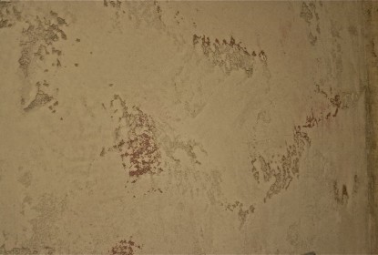
Author: admin

This clip shows you some of the fine details featured in my Venetian plaster style. In this architectural space, it was all about “Tuscan”.
To get that classic feel, we used Stucco Italiano, Intonachino, and Tadelakt. We’re industry specialists in these authentic lime plaster finishes, and I feel this video shows you exactly why. Enjoy!

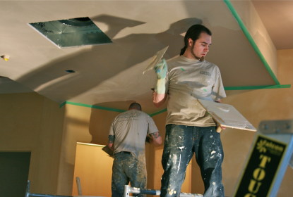
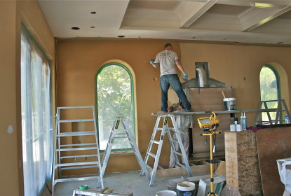
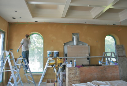
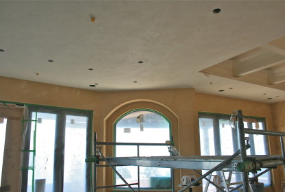
Since early June, I’ve been working on this large full-interior lime plaster project. By “large,” I mean a whopping 10,000 square feet.

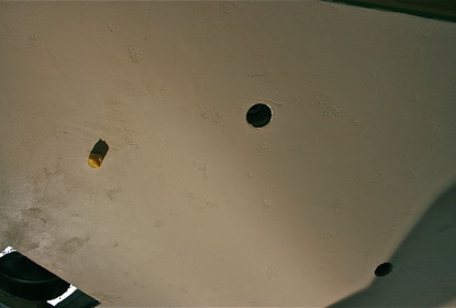
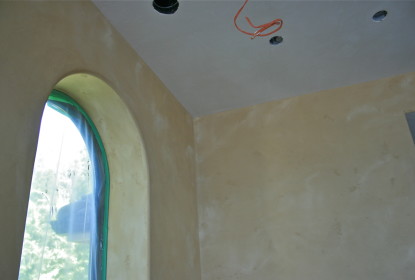
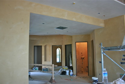
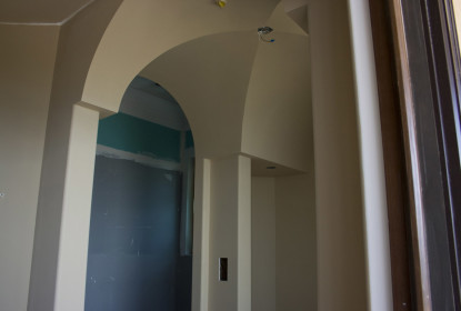
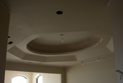
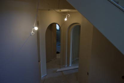
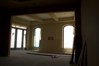
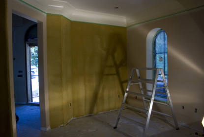
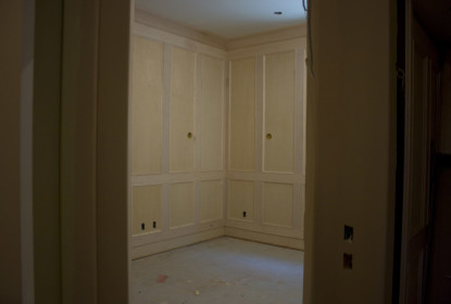
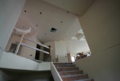
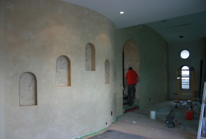
For me, I find it really amazing to see all the progress as I watch the Venetian plaster come together, and I thought I’d share some photos of the process so far, since I think you’ll like it.

This really is a massive project and something like this needs a lot of careful work even before it begins. With 10,000 square feet to dress up, it took a lot of colour-picking with the clients. We had eight colour changes and it was quite the struggle to nail the exact texture, but we stuck to the discussion until everyone was happy — something I don’t take lightly. I’m always up for making sure my clients have what they want on the palette before we get going. Isn’t that the whole point of the work? The client?

To start the project, I finished the ceilings off with Stucco Italiano’s Intonachino X-Fine because, with it, I could create the perfect amount of distressing in the texture.

We got the ceilings done before a final colour had been chosen for the walls. Was that a dilemma? Yup, you bet it was. We started on the walls anyhow, and the whole project slowed to a crawl because we could only basecoat the walls while I continued working towards the orangey-gold tones the client was after.

I find one of the tough things for clients is how to visualize the way things will look in the end. I’m an artist, I can visualize, but I understand why they can’t. Thankfully, technology’s starting to really make life simpler that way. I recently picked up an Apple iPad and loved how easy it made the client’s colour decision after I used it to highlight a few scenarios.

With my iPad, I pulled up some photos of both projects and concepts I thought would work well in this client’s space. I used it to show how using two colours can add a great deal of interest and movement on the walls. Doing all of this on a jobsite on a Sunday was a great deal of fun for me. I showed the client on the iPad, then jumped right into mixing a sample and showing the client how it all comes together in reality, right then and there.

With the iPad showing a wider vision and my skills showing the up-close in-person look, the colour and finish got approved, and here I am, already done with the main floor!

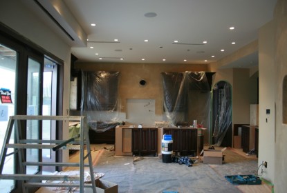
Here are some of the pictures of what’s happened so far, and I hope you enjoy them as much as the client does.

It’s a good thing you hire me to do finish and not videos, because this one took me a year to make! What can I tell you? I’ve had spaces to make beautiful, but I finally found some time to share this one with you.

I’m pretty proud of this Tadelakt fireplace I completed last summer, so I’m glad I’ve finally got the video to post for you, including closeups, so you really get a good look at my work.

So, you ask why Tadelakt lime plaster was my first choice for this project?

This is a good lesson in why the material’s such an important consideration. You need to know the end look you want and what combination of products to use to get there. It’s tricky, and it’s why you need artisans who know their stuff but also know the kind of use it’s going to get, so both look-appropriate and wear-appropriate products are used.

All I can tell you is, out of all the styles of Venetian plaster I keep in my arsenal, it’s Tadelakt lime that brings the smooth, silky, and finely-honed “stone” appearance that makes it MY number-one choice for restoring a fireplace.

Personally, I also think it takes the mother-of-pearl finish the best, since it’s all about the smoothness of the finish.

It’s also really tough, so, Tadelakt really rocks in high-traffic, high-use areas like the fireplace.

I hope the film gives you that feeling, too, and gives you a good look at the detail I’m so proud of.

Cheers

Darrell  Morrison

Recently, I finally got the tool I’ve been wanting to add to my company’s arsenal — a 12-colour carousel tinting machine.

You’re likely saying “A what?”

When I Say “Any Colour”, I mean It More Than Ever

For years, I’ve been creating custom colours. Many times, I’ve been unsuccessful because of technicalities, like not having proper colours available to me or a way to distribute them evenly or quickly among all the products I needed to mix to get the job done and done well.

Stuck working with these technicalities, a lot of my colours were found in one part of the colour spectrum — browns or tans, and even beiges now and then.

With the size of new lime-plaster interior projects and the new direction I’d like to take my Venetian plaster work in, I knew the time was right to get this tool that would make the difference in meeting my standards on a large scale.

As an example, I’m currently working on a 10,000 square-foot Intonachino lime-plaster interior. With so much surface to cover, the client is having a hard time choosing the perfect colour. We’re close, so they now only want slight shifts in shade and/or hue. (How are “shade” and “hue” different? Learn more by following this link.)

Picky? Not at all. Like me, they know job satisfaction is all about the details.

I’ve now taken great care to create 20 different colours for this project. That’s a bit of an extreme for any project, maybe, but you have to live with the colour long after I’m gone, and we need to get it right. I won’t get upset or rush you for a colour at the beginning of a project, because preparation and work can begin while we take the time to do the right things to help you come to a decision you literally can live with.

This tint machine makes my life easier and helps me live up to my dedication to getting you a a truly livable colour for your environment. Now, at any point in time, I can change a colour’s direction. You want a 25% lighter shade? Okay, not a problem. We don’t need a paint-shop pro or a chemist to guess it out. Let’s get that done ourselves — between you and me, and save ourselves a lot of headache and reduce wasted materials in the process.

Breaking It Down:

◦                                  Whatever your favourite material — Tadelakt, Intonachino, Carrara or Classic — I have full control over the colour and tint of the end-product.

◦                                  Your money gets saved because I’m not wasting materials or gambling on a factory’s ability to get those pallets of lime plaster tinted just the right way.

You want it lighter? Darker? I can change that on a dime now, so you get what you want when you want it. Hue by hue, shade by shade, we’ll nail the colour of your dreams.

On June 1st, I begin a great project — a 10,000 square-foot (Venetian) lime plaster interior. This project calls for a smoother finish with minimal texture, a “Tuscan” influence.

To get that look, I’ll be using Stucco Italiano Intonachino.

For an accent in the basement level, I’ll be creating a woodgrain finish (also known as faux bois) for all the crown moulding.

This home has a view to die for and architecture I’m excited to be taking to another level with my finishing techniques. I’m scheduled to reach final completion in early August.
With a Tuscan/Mediterranean feel throughout this home, getting the perfect colour so a client can be comfortable with their final decision is a tough task, but it’s got to be perfect — just look at the stunning architecture! Anything less than perfect would be a crime.

You might wonder how a “young” guy like me in this industry is landing big projects like these large interior Venetian plaster jobs, but I think my work speaks for itself — and it should, anyone’s should. I love the work I do, I do it the best way I can, I use the best materials that are available to me, try to deliver the best customer service, and have finished work that blows expectations away.

Whether it’s in my work’s detail or in the way I work for my clients, I know it’s the little things that make the difference. My guys and I are tidy and clean, flexible, and we all know how to work well with other trades.


Isn’t that how it should be?

Enjoy the read and the photos.

Cheers

Darrell Morrison

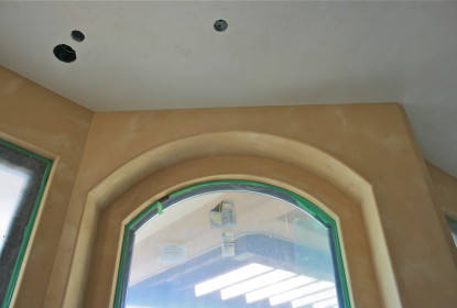
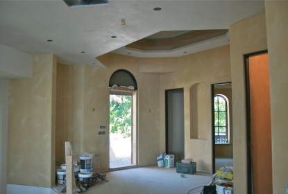
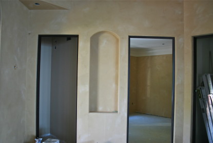
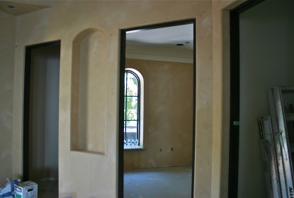
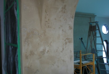
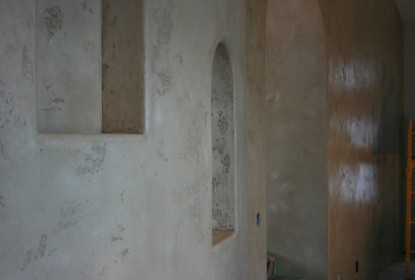
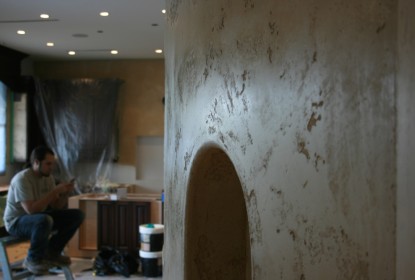
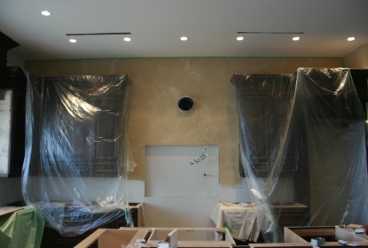
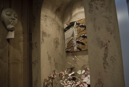
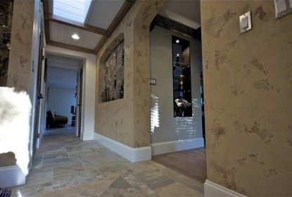
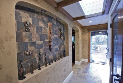
The last few months, I’ve been working on a Tuscan lime plaster interior in a beautiful custom home tucked away in Burnaby.


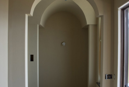
I’ve gotta say, the architecture blows me away. It’s my first plaster project in the area, and the home definitely ranks in the top 5 fave homes I’ve worked on. With curved walls, dominant archways, stunning distressed-wood doors, what didn’t I love?

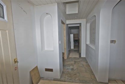
I was brought in to install a 4,000 square-foot Venetian Plaster effect. I’m nearing the 70% completion mark. Things will move along really quickly in the next few weeks, though.


Here’s a breakdown of what’s going on.


The materials of choice this time are Stucco Italiano and Intonachino lime plaster.

I choose to seal my Venetian plaster projects with penetrating sealer. This helps to repel moisture and oil. If you’re getting a great finish, shouldn’t it be protected for you to enjoy for decades? Yeah, I think so too.


Once the sealer dries, I’ll go over it with golden heavy-bodied glaze tinted to a light raw umber.


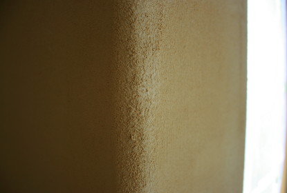
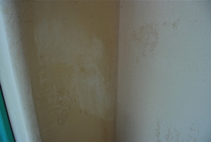
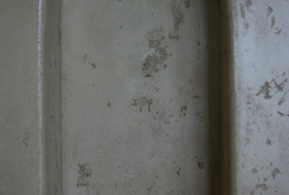
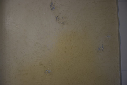
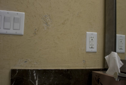
If I don’t do this overglazing step, the Tuscan plaster style looks too new and fresh — like the photo on the top left shows.

While I believe in sealing all my plaster, it’s really necessary if glazing Tuscan lime plaster. Why? It’s thirsty like you wouldn’t believe. If it’s not sealed before glazing, a catastrophe can happen. The raw umber glaze would stain the surface beyond repair — blotchy and horrible. The wall would need redoing from start to finish, and who wants that? I’ll get it right the first time.


This is also where being super-prepared before getting started means everything. If that glaze hits an unsealed wall next to the project, it could be a domino effect of colour catastrophes, so care always needs to be taken.


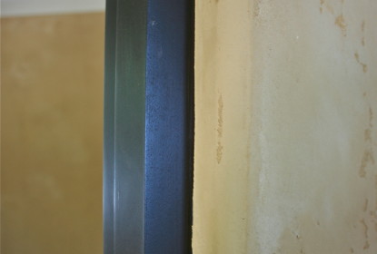
Check out these snapshots of some of last week’s great work. Catch you next time.

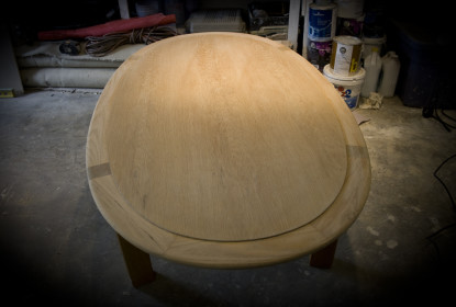
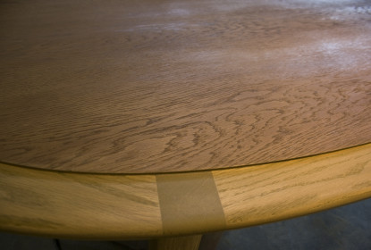
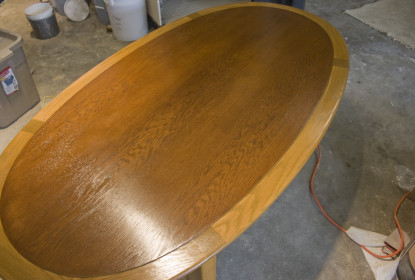
I’ve always enjoyed refinishing wood, including wood furniture. Last weekend, I decided to tackle a little side project of refinishing an oak table. I really enjoy the beauty of rejuvenated wood, so I was pretty keen to get started on this one.


Using a new 6-inch orbit sander with paper discs varying between 100- to 220-grit, I removed most of the old finish with great ease, compared to doing all the work by hand.


Something to keep in mind when refinishing any kind of wooden table is, it’s likely a veneer, and if you sand too much, you’ll wear through the woodgrain pretty quickly and hit the core-wood base — which isn’t going to have any of the grain’s appeal. This is where it’s dangerous to use an electric sander if you’re not sure you can control how far down it’s sanding.


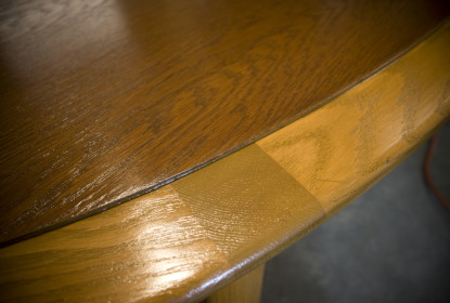
For this particular table, I figured using two different stains would work best. This choice was inspired by the table itself. Since the centre was slightly raised, I thought a contrast on each level would enhance the design.


I used 100% water-based stains and clearcoats for this refinishing job, and I’m thrilled with the results. The low-VOC content and lack of smell was great, and I absolutely plan to work with these projects again when I’m on larger projects.


Check out the photos and you’ll see why I’m feeling good. I hope more of these tasks come my way in the future.

Over the past week, I had the opportunity to work on the new Bosa building in White Rock, BC, with one of my favourite designers — a big fan of my style of Venetian Plaster. She’s always pushing me to try new things and stretch my creativity, so it’s a great working experience to be around her.


When meeting a new client and designer, the most important part of the meeting is being able to absorb their ideas and use that as inspiration for creating a unique design that’ll reflect the best of everything they want.


I think I pulled that off, and it’s even reflected in the materials we used.


For this project, I used Carrara Marmorino. It’s different because of its small granules, which allows it to polish to a beautiful satin finish. For added durability and a beautiful finish, I sealed the surface with natural beeswax.

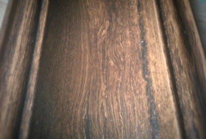
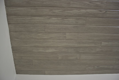
So why would you want to use wood graining on your project? Lets start with the creativity, being able to control the colours and style of wood your looking to get is much easier when its created by hand, id say that’s a big asset. Next would be its Eco-friendly no need to replace any existing wood or if your building a new home MDF (medium density fiber board) is a great option as its cheaper to buy then real wood and saves the environment from another tree cut down. The 1st picture is a sample I created for an upcoming project the client loved it so much they have decided to d0 3000 liner ft. the cost savings is amazing and leaves room for lots of creativity. I will be sure to write a blog post about it once the project starts.

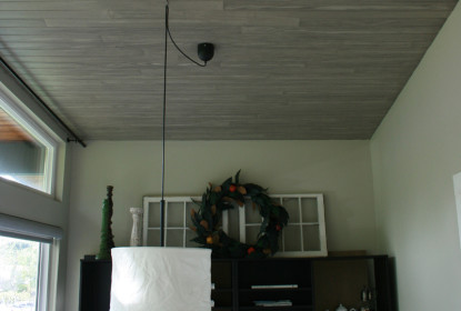
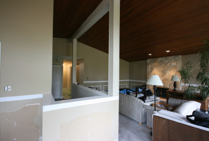
Now back to the ceiling, this home had that old school west coast style with the cedar ceiling from the exterior spanning all the way into the living room it looked great but the colour was way to orange and this client wanted to go more restoration hardware style. So I went to the drawing board and this is what I came up with. Painting the ceiling out in a solid colour was a great start then an idea hit me I want to make the ceiling look like a hardwood floor with different size pieces of board well lets say great idea TON of work, take a look closely at the pictures and you can see how the joints look natural and the wood flows as it should.

Conclusion Many considerations need to be taken in before starting a project like this, remember that wood is a natural thing it would not come in 20 ft lengths (in most situations) try to keep it simple avoid using more than 3 colours as the more you use it adds to the cost$$ think shading. I hope you have enjoyed my post and hey leave some comments I will answer questions.

In this renovation, the homeowner knew exactly what he wanted: A great living space with a lot of detail.

I’m not kidding, he left no corner out. Now that’s my kind of attention to detail!

I was commissioned to turn this doorway from “BLAH!” to “WOW!”

To do that, I chose to use Intonachino. I kicked it off with tinting the materials to a light orange/tan, using three colours to mix it from scratch: Raw Sienna, Red Oxide and Raw Umber (but the links are not the actual brands of the materials I use to tint my plaster; just great information pages for you to check out).

After, the finish was left to sit and cure for a few days before I returned to apply the all-important penetrating sealant before doing a beautiful raw umber glaze.

What do you think about this kind of finish?


Contact

Office:: 604.628.7855 | Direct:: 604.779.4233 | 9am to 5pm Monday – Saturday

Name
Email
Message

Thank you! Message sent.
Error! Please re-check that all fields are complete.
©Copyright 2019 Decorative Paint & Plaster Concepts Inc.